Last Updated: 4/30/2019
I frequently get questions on the best size for background images from designers I work with. Full screen backgrounds have become more and more popular in the last couple of years and, I think, will remain so for at least a few more.
The question asked is usually something like:
“If I want to put a background image on a website that will span the background regardless of the display size a user is using, what would be the pixel dimension of the image?”
I’ve considered this question before on sites I developed like Kona Boys, BAS1S Architecture & Design, Mountain Girl Fitness, which use full-width background image sliders. So, the last time I got this question, I thought I’d take the time to formalize my answer (originally in late 2012).
The Short Answer
- I recommend 1920 x 1080 or smaller with a ratio of 16:9, which is 1.777 to 1. (Prior to May, 2014, I recommended 1440 x 900.)
- For making it happen, I recommend using media queries to select the appropriately sized image from a pool of 2 or 3 sizes.
The Long Answer
Why It Matters
The background image size question is important because it is a balancing act of trade-offs to get the best performing and best looking site. Depending on how heavily your site’s look, feel, and branding rely on the background images, choosing the right size could have a huge impact overall.
Recently, full screen sliders and backgrounds have become hugely popular in general, and specifically in “flat” style designs.
A few of the trade offs when it comes to background images:
- grainy vs. slow download
- squished vs. stretched
- cropped horizontally vs. cropped vertically
- fixed vs. scrolling
- independent vs. integrated with other element positions
Some Examples (as of original writing)
Here are some examples of bigger corporation websites using full screen background images:
- 1400 x 875 –1.6 ratio– Patagonia
- 1920 x 1080 –1.78 ratio– General Motors
- 1920 x 1165 –1.65 ratio– Zara Clothing
- 2560 x 1707 –1.5 ratio– Burberry
- 1800 wide — Burger King
- 1600 wide — Nike
- 1440 wide — Adidas
Here are some lists of other sites to check out:
- http://www.inspiiired.com/75-websites-featuring-full-screen-photo-backgrounds/
- 60 Websites Using Fullscreen Photographic Backgrounds
- Best Fullscreen Websites
Desktop and Laptop Screen Resolutions
One part of answering this question is looking at screen resolution. After all, the screen size plays the biggest part in how your work is going to be presented.
When it comes to just screen resolutions, the most popular Desktop, Tablet, and Console (not mobile) resolutions in North America currently (April 30, 2020) are:
- 1920 x 1080 (1.78:1 ratio)
- 1366 x 768 (1.78:1 ratio)
- 1440 x 900 (1.6:1 ratio)
- 15368 x 864 (1.78:1 ratio)
- 1600 x 900 (1.78:1 ratio)
- 1280 x 800 (1.6:1 ratio)
- 768 x 1024 (.75:1 ratio)
- 1024 x 768 (1.33:1 ratio)
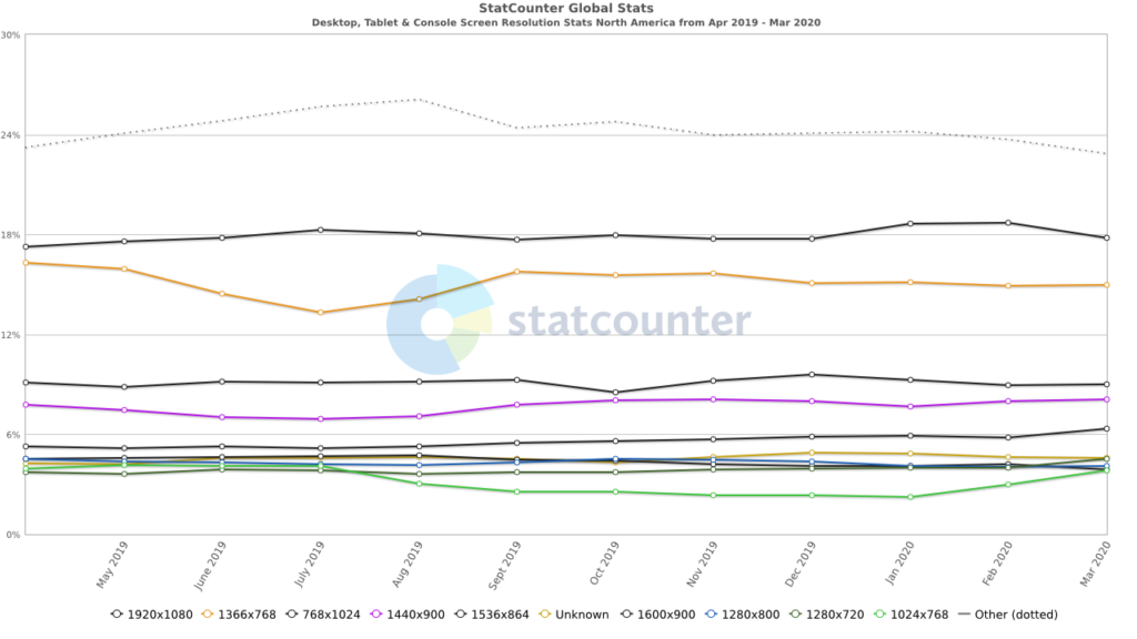
Source: StatCounter Global Stats – Screen Resolution Market Share
1920 x 1080 and other monster professional displays that support resolutions up to 2560 x 1600 are becoming more and more common…perhaps our eyes are going bad, or we’re just trying to soak up as much radiation as we can.
There’s a good listing of common resolutions for desktops, laptops, and mobile devices on Wikipedia here.
What’s Selling
A quick search on Walmart or Amazon for computers sold with monitors reveals that most new laptop computer or new monitors are:
- 19.5″, 1600 x 900, 16:9 (1.78 to 1)
- 20″, 1600 x 900, 16:9 (1.78 to 1)
- 21.5″, 1920 x 1080, 16:9 (1.78 to 1)
Look for the 16:9 (1.78:1) aspect ratio to grow in popularity and number of users over the next decade. Note that 16:9 is the standardized HDTV 720p/1080i display size and is “HD ready.”
Mobile Devices
On the flip side, there are mobile devices with much smaller resolutions–800 x 480 for Samsung, 320 x 480 for iPhone–in addition to maximum image size limits before things break. There’s a good, long list of mobile screen resolutions here. Also, there’s a nice, quick reference of just iOS resolutions here.
Time and frustration saving tip: the maximum size limit for images to display correctly on the iPad 1 – iPad 4 is 1024 x 1024 x 3 = 3,145,728.
Here are StatCounter’s numbers for the most used mobile screen sizes in North America.
- 320 x 568
- 360 x 640
- 375 x 667
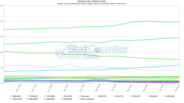
Source: StatCounter Global Stats Mobile Screen Resolutions in North America
Here’s my own shortlist of mobile screen resolutions that I consider when developing a site:
| short side | long side | ratio | example |
| 240 | 320 | 1.33 | Android SDK |
| 320 | 480 | 1.50 | iPhone |
| 360 | 640 | 1.78 | Nokia nHD |
| 480 | 554 | 1.15 | Motorola Droid |
| 480 | 800 | 1.67 | Samsung Galaxy |
| 600 | 800 | 1.33 | Kindle 3 |
| 640 | 960 | 1.50 | iPhone 4 |
| 768 | 1024 | 1.33 | iPad 1 – 4, many desktops |
| 768 | 1366 | 1.78 | most new desktops |
| 800 | 1280 | 1.60 | older desktops |
| 875 | 1400 | 1.60 | |
| 900 | 1350 | 1.50 | |
| 900 | 1440 | 1.60 | desktops last 5 years |
| 900 | 1600 | 1.78 | most 20″ monitors |
| 960 | 1280 | 1.33 | |
| 1080 | 1920 | 1.78 | most 23″ monitors |
| 1200 | 1733 | 1.44 | |
| 1328 | 2000 | 1.51 | |
| 1600 | 2560 | 1.60 |
Retina Devices
Retina displays are becoming more common and have their own special issue–to maintain the image clarity we hope for, the image needs to be 2x bigger. This holds true for background images as well as standard image elements.
Retina displays, like those on iPad 3rd generation and up, iPhone 4 and up, and many others, use more pixels per inch than a standard screen (here’s some good detail on that from Wikipedia). This makes standard-sized images look a little fuzzy when viewed on the high-density screens. Web developers overcome this by creating images that are twice as big as normal and then displaying them at half the size. The end result is an image that is the same size that you wanted it to be in the first place, but it looks great on both standard and high-density screens.
This can make for some really big images when you’re talking about full-screen backgrounds. If you’re not careful, this can increase your page’s download size and therefore, download speed. The good thing about backgrounds, though, is that they aren’t typically retrieved by your device unless they’re visible on the screen. So, if you put a background in a media query that is never called by the page, that image is never retrieved, saving the bandwidth.
I did a quick case study using apple.com/iphone and they handled it by simply doubling the size of their background images at three different screen resolutions. See this discussion in the comments below for the full detail and CSS code.
Apple went with these for non-Retina:
- 1440px x 678px for screens 1024 and up
- 1068px x 648px for less than 1024
- 736px x 460px for less than 768
For Retina (using “-webkit-min-device-pixel-ratio: 1.5″ media queries), they went with:
- 2880px x 1356px for screens 1024 and up
- 2136px x 1296px for less than 1024
- 1472px x 920px for less than 768
Each of the background images are doubled for Retina. So, if you trust Apple as a good standard, then I’d say go with double.
Download Speed / Page Loading Time
There have been a couple of bigger studies (gomez.com and akamai.com) discussing how page loading time affects sales. They conclude that:
Slower load time = unhappy users = fewer sales
KISSmetrics has an excellent infographic with the details.
So, how much is that perfect background image worth to your design? And, if you’re using several background images for a slider or fader, how big is just big enough to keep load times snappy?
If I know a page must have large image elements, I typically shoot to keep the entire page to under 1MB total size. (This is too big in my opinion, but still doable for most visitors today.) I try to keep any single image at less than 100KB.
Another consideration is whether or not the same background image(s) will be reused throughout the site. If you’re using the same big background image on all, or even several, pages of your site, you can afford to use a higher resolution because after the initial load, it will be cached in your visitor’s browser. However, if you’re using a different image on every page or each new section, your visitor will have to download each and every one, causing longer page load times.
Similarly, if you’re using a single background image, you can obviously afford a higher resolution than if you have to load several images for a background slider.
Implementation
Fixed Size vs Fluid vs Responsive
Perhaps the biggest part of implementation is whether or not your site is a static size. If you have a fluid layout site or a site that uses media queries to serve up different structures, you will have different needs.
On a fixed size site, you worry about the edges of the background image in relation to the screen size. Will you keep the image centered, to the left, or to the right? Will it stretch, be cropped, fade out, or repeat? If it stretches, are the foreground elements still readable? Etc.
On a fluid site, you have to consider all of the fixed-sized site questions at all possible screen sizes. Will the background image move with the content? Will it resize to shrink or stretch? If it resizes to tiny or huge will it look ridiculous or have blank margins?
On a responsive site that uses media queries, you consider the fixed-sized questions but have a ‘get out of jail free’ card…well maybe not ‘free.’ With media queries you will have the ability to swap out the background image(s) to fit the exact needs of each screen size you’d like. Creating background images for several specific screen sizes can be a lot of work, but it means that you can keep the site looking just as you’d like it.
CSS and JavaScript
Another part of answering the question is thinking through how you’re going to make it happen. There are currently at least a half dozen ways to implement a full screen background image or slider. Apart from plugins and pre-built sliders that take care of it for us, there are these relatively simple methods:
-
-
- CSS3: background-size: cover
- CSS3: background-size: contain
- CSS applied to <img>: width: 100%; height: auto; min-height: 100%; min-width: 1440px
- CSS applied to <img>: top:0; left:0; position:fixed; min-width:100%; min-height:100%;
- jQuery: See this CSS-Tricks article
-
Each of these methods has strengths and weaknesses, but you’ll need to sort through which one is going to be best for each specific site.
Special Note for Slider Implementation
If you’re using several images to rotate into the background, I highly recommend using javascript to lazy load the images. The idea is to wait until the page finishes loading before loading the background slider images (except the first one, which should load initially). Otherwise, visitors will have to wait patiently while the big images download…and who’s patient these days.
Design Considerations
In many designs the background image can stand apart from the foreground elements. Often times the navigation and main content blocks have enough visual separation from the background image that you have more flexibility in how the background image looks. If the image is squished a little or cut off a little or shifted left or right a little it doesn’t affect the overall design.
Sometimes, though, the background image is integrated into the design and requires specific sizing and positioning. Say, for instance, that you have a big swoosh in the background image that MUST cross the header a just the right place. Or, say you have a face or person that would look totally out of place if it is moved or covered by a foreground element. In those cases, you have much less flexibility in background image size. The decision is essentially dictated by the design and you do what it takes to make it fit. Often, ‘what it takes’ is using media queries to provide the same image at several sizes to fit varying screen sizes.
Concluding Thoughts
With all of these screen resolutions, download times, and implementations to consider, how do you pick the appropriate background image size to keep the user experience solid? Many developers shoot for something in the middle, picking an image size that is big enough to not get pixely, small enough to download quickly and work properly, and with a ratio that will cause as little distortion–squishing or stretching– or cropping as possible.
-
-
- Combined, people using a 1.6 ratio make up the bulk of current users
- There is growing popularity and availability of 16:9 (1.78 ratio)
- However, millions of people are still using good ol’ 1024 x 768 (1.33 ratio)
- I usually want everything in the image to be seen–there aren’t often throw away portions on my images
- An optimized color jpg picture of 1440 x 900 ends up being around 100KB in my experience, which is big, but not huge for most devices and download speeds today.
-
Given all that, I have chosen to use a ratio of 1.6 to serve today’s users, knowing that my images are often going to be cropped or squished by newer monitors and devices.
The 1.6 ratio usually makes my images have everything showing when resized if I’m working on a site that doesn’t maintain the aspect ratio or requires pushing part of the image into an unviewable area. I choose 1440 wide to accommodate most new screens.
So Then
-
- 1440 x 900 is my magic number for general full screen backgrounds.
- If it is a partial screen height design, then I keep 1440 and do whatever height is called for.
- If it is a full width background slider with more than 3 or 4 images, I size it down as far as 960 x 600 to save on load time without diminishing image quality too much when they stretch.
- If you can, use media queries to serve from a pool of 3 or 4 perfectly-sized images for each image in your background


very useful, ty 🙂
Glad it helped, thanks Maria.
Hello Aaron,
Have been reading your site and many others but cant find a solotion to my problem with the postion of my site on some tablets. It did work fine on a ipad and on my computer screen but on the android tabelt it keeps moving to the very top and showing a couple of cm of the webpage. This is my first site I made and kind of made it difficult to make. Have been strugling for a long time so hope you can help.
body {
background: #000 url(“images/rocks_stones_pebbles_1280.jpg”) »
background-position:fixed;
-moz-background-size: cover;
-background-size: cover;
-webkit-background-size: cover to
-webkit-background-size: cover !important
I havent got much experience.
}@media only all and (max-width: 1024px) and (max-height: 768px) {
body {
-moz-background-size: 1024px 768px;
background-size: 1024px 768px;
}
With a background-position:fixed declaration, you should just need the background-size:cover (and it’s vendor variations like -moz-background-size). Because it looks like you’re wanting the background to fill the entire screen at all screen sizes, you shouldn’t need to use a media query for the 1024px size. Instead, the non-media-query body{} declaration should take care of it all.
I’m not familiar with any specific issues that would make it behave differently on the Android tablet. It seems like the following should work for you:
body {

  background: url(“images/rocks_stones_pebbles_1280.jpg”) no-repeat fixed 0 0 #000;

  background-size: cover;

  -moz-background-size: cover;

  -webkit-background-size: cover;

}
I agree nice jumping off point for figuring out image sizes – thanks!
My pleasure, thanks Nikia!
It was really helpfull
HI there,
thanks for the info, was helpful, but im still stuck on how to exactly place my background in dreamweaver to fit all screens(auto size). my first attemp wqas high res at 2880×1800 which i guess is too big hey!?! im using CS5.5
all the codes ive tried are not working and dosnt fit to screen and have to scroll which i do not want at all as its my back ground home page. can you please me? so i guess 1440×900 is my best bet as you say.
thanks alot and great info! 🙂
My pleasure Shea.
To make a background not scroll with the page–stay in place while everything else moves over the top of it–you need to set its CSS background-position to “fixed” like this:
background-position:fixed;
In terms of size, you'll have to make the call as to what is most important: that the image keep its aspect ratio--not squish, or stretch; or that the image fill the entire screen.
To make it fill the entire screen with no hard edges on the sides, you can use the background-size property and select the best of "contain" or "cover" for you. Or, if you are using an image set behind everything (as opposed to an technical "background image") then you can set its width to 100% and height to auto and pick a size that will not be chopped off vertically for most screens.
width:100%;

height:auto;
Note that this is all done in the CSS. So, in DreamWeaver you'll need to search the help files for how to edit the CSS for your page, be it inline CSS or a separate stylesheet.
Great article and such valuable information. I hardly ever comment on articles but couldn’t leave without saying “job well done.” I am going to bookmark and study your advice. Thanks so much.
I would guess the jump in 1024 is ipad mini with maybe users using chrome on so it looks like desktop browsers.
Hi Aaron:
I have an image size of 1680 x 602 pixels. I’m using sliderJs to show the slider of 2 images. My page shows a horizontal scrollbar after setting the images. How do I set it to 1440 as you suggested? Do I need to slice the image again from Photoshop?
Thanks!
Aloha Mike! I’m not sure I can diagnose without seeing more code, but from what you did say, I’ll take a reckless stab at it.
Usually, you get a horizontal scrollbar when an element is wider than its container and its container is set to either overflow: auto or overflow-x: auto. Sometimes, the fix you need is to just explicitly tell the element to crop the overflow with #your-container-here{overflow:hidden;}.
Assuming that’s your case, it sounds like your 1680 image is too wide for the container. One way to correct that would be to use images that match the size of the container, like you mention. Another way would be to tell the images to fit within the container using something like: #container-id-here img{max-width:100%;}.
If you are using the images as backgrounds instead of images, then it sounds like your container element is too wide, either by a CSS declaration in a stylesheet, or as calculated by your script and added to the element. In that case, you’ll need to either define the width more clearly (like: width:100%;) and/or set the overflow to crop off anything beyond the page width using something like: #your-container-here{max-width:100%; overflow:hidden;}.
Hi Aaron:
Thanks for the lightning response. Here’s my code below. The 2 images have 1680 x 602. I would greatly appreciate if you can take a look and let me know what I’m missing. Thanks!
//css
.defaultInnerWrapper { width: 1680px; margin:0px auto; padding: 0;}
.slidercontainer {overflow:hidden;}
.contentInnerWrapper { width: 1680px;};
//html
//jquery
$(function () {
$(“#slides”).slidesjs({
preload: true,
width: 1680,
height: 602,
play: {
effect: “slide”,
auto: true
},
pagination: { active: false },
navigation: { active: false },
callback: {
start: function (number) {
}
}
});
});
Hi Aaron
Oops. it looks like it stripped my //html code. Not sure if this will be visible. Here it is:
//
//
//
//
//
//
//
//
//
//
//
//
Ok, my silly attempt for posting html code. I tried removing the tags to see if it this wont be stripped out.
//html
div class=”contentInnerWrapper”
div class=”defaultInnerWrapper”
div class=”slidercontainer”
div id=”slides”
img src=”images/consumer_slide1.png” alt=””
img src=”images/consumer_slide2.png” alt=””
div
div
div
div
:
Hi Aaron,
Thanks for your valuable tip. This lead me to the right direction and now it is working! Keep up the good blogging! Thanks again.
Mike
Glad to help Mike. Sorry I didn’t get to your other posts in time, but I’m happy that you got there. What was the final solution?
Hi Aaron:
The defaultInnerWrapper had a width of 1200px. Just like you said it was smaller than the image. I added the max-width and overflow hidden as you recommended. I had to figure out which div to set the max-width because i had 3 divs tags but eventually it worked! You saved me a ton of debugging! Keep up the good blogging.
Mike
Thanks a lot for doing these detailed explanation into background image sizes. Our of interest what do you think is an acceptable file size for a background image assuming your not using a CDN?
My pleasure Fran, glad you found it helpful.
Your question has a lot of variables to consider to get to a good answer (notice I say “good” not “right” because I’m not convinced there is one right answer here). For instance, will the main audience be using a fast connection or slow? Be on a desktop or mobile device? Tablet or phone? Or, all of the above? Is the site set up as mostly brochure or for e-commerce? Is it information heavy or image heavy? How important are the background images to the branding and message of site? Is server space, bandwidth, CPU, etc a consideration?
To answer, I’ll think of a ‘typical’ brochure-type site that gets mostly desktop visitors with a smaller portion of mobile visitors and no restrictions on server bandwidth.
Given these, my rule of thumb is that the entire page should be under 1MB in size. This is a number I’ve come to over time and is supported only through anecdotal evidence, not real hard data. 1MB seems to load quickly enough for most people today that they don’t bounce, that they aren’t annoyed at a slow-loading site, and that visitors still take the actions you want them to. I use 1MB as an absolute upper limit, not a target to reach. Ideally, all pages would be 1/10th that size. So, depending on the other page images, scripts, etc, the file size of the background image can be bigger or smaller.
In my experience, a single background image shouldn’t have to be any bigger than 125KB. This accommodates a pretty colorful image, 30% – 50% jpg compression, and a height and width of somewhere between 1024px and 1600px. Any bigger than that and I recommend lowering the image quality, blurring the image in ‘unimportant’ non-focal areas, or finding an image with less color variation that will better compress. Ideally, I like to see background image file size at around 10KB to 30KB.
Awesome article, thank you for posting!
Hi Aaron,
I bought a wordpress theme that had a tileable background. I wanted the background to be an image, when i uploaded the image it worked great on my 15′ inch laptop. When I tried my website on a larger screen, the background didn’t fit the whole screen and the sides looked terrible. So I asked about a way to make it fit any screen size, and I got the following code
body {
background-position: center center;
background-repeat: no-repeat;
background-attachment: fixed;
-moz-background-size: cover;
-webkit-background-size: cover;
-o-background-size: cover;
background-size: cover;
}
#header {background: url(http://www.oussamaharb.com/wp-content/themes/locus/style/images/light/clear.png) center center no-repeat fixed; }
Now the background looks great and fits all screen sizes, but a problem in the header arises after using this code. When I scroll down, the stuff are getting under my name in the header because it’s transparent. I don’t want to use a different background for the header. Do you have any solution for that? I can make the background image so big to fit any screen size without using the code provided above, but the size of the image is going to be around 400 KB which is not a good idea. Can you help me please?
Thanks for your question Ouss.
After a quick peek at your site, I see the issue you’re describing. It looks like your theme sets the same background image for both the body and the header and then uses positioning to make it look right.
Using the following code worked for me in Chrome. I just repeated the same background image you’re using and positioned it to match the body’s background image.
#header{

   background: url(http://www.oussamaharb.com/wp-content/themes/locus/style/images/light/bg3.jpg) no-repeat center center fixed #dcdcdb;

   -moz-background-size: cover;

   -webkit-background-size: cover;

   -o-background-size: cover;

   background-size: cover;

}
Other options could be:
a. Make the background image big enough to fit the largest screen you want to accommodate (as you mentioned)
b. Create a separate background image for the #header div that isn’t clear
c. Use a background color for #header that compliments your theme and looks okay filling the top area to hide scrolling
It worked! Aaron you are a genius! I asked 3 web designers, including the person who actually made the theme and none of them thought of matching the positioning. I appreciate your help. Thank you! 🙂
My pleasure, glad it worked for you!
I have one more question, it’s not related to background but I didn’t know where I should post it in the blog so I’m sorry in advance if I shouldn’t post it here.
I’m trying to create caption on each photo in the slider with the same style/position as it’s made in this theme http://theme.semicolonweb.com/pageflow/
It’s not working. Is it something you can help me with?
Hello Ouss.
I’m not familiar with the theme, but it appears that in the example they are using what they call the “ei-slider” whereas you are using the ‘flex-slider.” Do you have the ability within the theme to choose a different slider for the homepage? If so, I’m guessing there are options specific to the title and subhead text for you there.
As you can see from the example, here’s the format they’re using for the slide text area:
<div class="ei-title">

     <h2 style="opacity: 1; display: block; margin-right: 0px;"><span>text of the printing</span></h2>

     <h3 style="opacity: 1; display: block; margin-right: 0px;"><span>lorem ipsum is simply dummy text of the printing and typesetting industry.</span></h3>

</div>
Thanks Aaron!
Very well explained…and am pleased with the research based approach to answering this particular web design issue!
Cheers!
this is well organized and very useful information. Thank you for this post! I am making my background image today the right way.
Hi Aaron
Really useful information, thanks. Been chopping and cropping in Photoshop to try to get the best size for my slider. Guess I should have asked Google first!
Dom
Hi
Good article. I was worred about having a bakckground image of 60k but it is the same bg image used throughout the site and I will be using a CDN and cache plugin for WordPress.
Glad I found this article, thanks.
Cool thanks. I need to make a background image. This help a lot.
Great article, answered a lot of my questions on the subject!
Don’t know anything about coding, but I am interested in the “design” part since I’m an graphics designer. Found it very usefull to read! 🙂
Hi
I am ui designer have problem with layout size for full screen single page responsive layout design what is size for design this my 1st work any help me
Hi Aaron,
This stuff was really helpful, but i happened to end up with a new problem.
I want to use a background image for my website first page, knwkit.co.nr.
But, i also want to mask the image.
Have I any way so that i can mask the image and use the auto resizing script also.
Thanks in advance.
Hello Knwkit, thanks for leaving a comment. It looks like your site is not yet up, so I’ll take a swing at your question. Can you tell me what you mean by “mask the image?”
If you mean place on background on top of another, there are a couple of options. The most straightforward, but less backward compatible is to use CSS3’s ability to include multiple backgrounds for a single element. Chris Coyer has a nice explanation of it here. In short, if you have:
.masked-bg{

   background-image: url(image.jpg);

   background-size: cover;

}
You’d add a comma and your second background declarations right after each of the first ones, like this:
.masked-bg{

   background-image: url(image.jpg), url(mask.png);

   background-size: cover, cover;

}
Wow! A lot of effort invested in this post – much appreciated. Your opinion please? I’m designing a luxury website that demands retina quality. To simplify my question here.. Say I go with your philosophy and determine my full width images on this project will be 1440 px wide. Then, I am creating an @2x version of that image at 2880 px wide. Is this a solid concept? Or breaching the danger zone for site performance?
Bottom line, my client wants a “full screen” home / entry page. Ideally filling the exact height and width of viewers screen, with retina quality?
How would you size the “full screen image” and it’s “retina” twin image?
Thanks Dean, I’m glad you found it helpful.
The short answer is, yes, create a 2x version of your images. Until your post, I hadn’t thought through full screen Retina backgrounds. Practically speaking, I figured that if it’s in the background, it’s a supportive element to whatever is intended to be the focus and, therefore, is okay if it’s not Retina clear. Now that you asked though, I can see a number of cases, increasingly, where Retina-ready backgrounds would be a must.
Like with many things concerning Retina development, I went over to apple.com to see how they handle it. I went to the http://www.apple.com/iphone/ page, which at the time of this writing is showing off nice pictures that were, “Shot on iPhone 6.” And, it turns out they’re using background images for that main photo element. Apple went with these for non-Retina:
– 1440px x 678px for screens 1024 and up
– 1068px x 648px for less than 1024
– 736px x 460px for less than 768
For Retina (found by looking for the “-webkit-min-device-pixel-ratio: 1.5” media queries), they went with:
– 2880px x 1356px for screens 1024 and up
– 2136px x 1296px for less than 1024
– 1472px x 920px for less than 768
Each of the background images are doubled for Retina. So, if you trust Apple as a good standard, then I’d say go with double. You’ll want to have enough size variations to do your best to manage the overall download size (you won’t want an old iPhone to have to download and use the 2880px wide version for instance).
Here is the pertinent CSS at the time, for your reference:
.section-showcase .hero-image {

    position: absolute;

    left: 50%;

    top: 50%;

    margin-top: -337px;

    margin-left: -720px;

    background-repeat: no-repeat;

    background-size: 1440px 678px;

    height: 678px;

    width: 1440px;

    background-image: url("http://images.apple.com/v/iphone/home/m/images/iphone_tab_cotter_large.jpg");

}

@media print, only screen and (-webkit-min-device-pixel-ratio: 1.5), screen and (min-resolution: 144dpi), screen and (min-resolution: 144dppx) {

    .section-showcase .hero-image { background-image: url("http://images.apple.com/v/iphone/home/m/images/iphone_tab_cotter_large_2x.jpg") }

}

@media only screen and (max-width: 1023px) {

    .section-showcase .hero-image {

        background-size: 1068px 648px;

        height: 648px;

        width: 1068px;

    }

}

@media only screen and (max-width: 1023px) {

    .section-showcase .hero-image { background-image: url("http://images.apple.com/v/iphone/home/m/images/iphone_tab_cotter_medium.jpg") }

}

@media only screen and (max-width: 1023px) and (-webkit-min-device-pixel-ratio: 1.5), only screen and (max-width: 1023px) and (min-resolution: 144dpi), only screen and (max-width: 1023px) and (min-resolution: 144dppx) {

    .section-showcase .hero-image { background-image: url("http://images.apple.com/v/iphone/home/m/images/iphone_tab_cotter_medium_2x.jpg") }

}

@media only screen and (max-width: 767px) {

    html.touch .section-showcase .hero-image {

        background-size: 736px 460px;

        height: 460px;

        width: 736px;

    }

}

@media only screen and (max-width: 767px) {

    html.touch .section-showcase .hero-image { background-image: url("http://images.apple.com/v/iphone/home/m/images/iphone_tab_cotter_small.jpg") }

}

@media only screen and (max-width: 767px) and (-webkit-min-device-pixel-ratio: 1.5), only screen and (max-width: 767px) and (min-resolution: 144dpi), only screen and (max-width: 767px) and (min-resolution: 144dppx) {

    html.touch .section-showcase .hero-image { background-image: url("http://images.apple.com/v/iphone/home/m/images/iphone_tab_cotter_small_2x.jpg") }

}
Very useful, thank you.
Hi, I just found this article when trying to create a WordPress theme and wondering which image size is best for the hero content. This is very useful statistics and analytics. Thanks for sharing and doing the hard work!
I am trying to get the initial page down in size, using the slider with images at around 1200×300 and having a real hard time keeping images under 250k each. In fact some of the images are over 500k which. I currently export them as PNG. should i use another format? This is for http://www.arielimobile.com
Hi Serge, thanks for writing in. In my experience unless I absolutely have to have transparency in my image, or need it to be really high quality, I save all images as jpg’s. I typically find that a jpg saved at 50% to 75% quality is plenty good. This should drop your filesize quite a bit.
Hi Aaron, thanks for sharing knowledge. I’m the opposite of savvy on this subject but i need to educate myself. There is something (very basic i guess) i don’t understand. Websites like these https://unsplash.com/ have great photography with large jpg sizes (2MB, even 6MB). Yet those websites load lightning fast? Most instructions i saw about building your own WordPress website advise against these large volumes. Could you explain this?
Thanks, Joël
Thanks for your comment Joël. Sites that rely on high-resolution, bigger images have developed strategies to get the site to load fast even with the large images. Each site has different approaches to get there. Some use lazy-loading, progressive loading, or other techniques to not load images until they are in the viewport. Many use content delivery networks (CDN’s) so that many images can load at the same time from several servers that are geographically close to the site visitor. Those CDN’s will often be “cookie-less” so that there are fewer round-trips to servers with less information. Sites also work hard to reduce the overall page size by combining and minimizing the structural and presentation code that makes up site, things like the CSS, JS, HTML, and other inclusions.
One of the best ways to tell how a site is loading so quickly is to investigate it with a tool like webpagetest.org or tools.pingdom.com/fpt/ or https://developers.google.com/speed/pagespeed/insights/, which give you a detailed breakdown of how big each element on the site is and how long it took load. Some of these tools, like Pingdom or Google, also give tips on how to make it faster.
Using the Pingdom tool on Unsplash reveals that they have done a great job. The page is really large by web browsing standards–12.6MB, but it loads in a quick 2.0 seconds. Most non-professional websites that size would take much longer to load. On the “Page Analysis” tab you’ll see that they’ve kept their code footprint surprisingly small and done a great job of minimizing the number of requests (round trips) from the browser to the server. They are also using at least 3 different domains to load the content, often cookie-less. They also have a great server response time, which means they’re likely using solid (not cheap) hosting.
Run these tools on your site to get some detail into what you can do in your specific case. You can also use the “Developer Tools” in Chrome or Firefox along with the Y-Slow add-on to get a helpful element-by-element breakdown of download duration, size, and flow.
Love how you give a short answer first and then a complete answer. Thank you
Hi Aaron,
I want to use an image as background for my website, but it always tiled in the browser, I want to stretch it and tried different solutions given on the net, but somehow nothing working for me. My sample page is [redacted]. Could you please help me, Thanks in advance.
{ margin: 0; padding: 0; }
html {
background: url(‘images/yourimage.jpg’) no-repeat center center fixed;
-webkit-background-size: cover;
-moz-background-size: cover;
-o-background-size: cover;
background-size: cover;
}